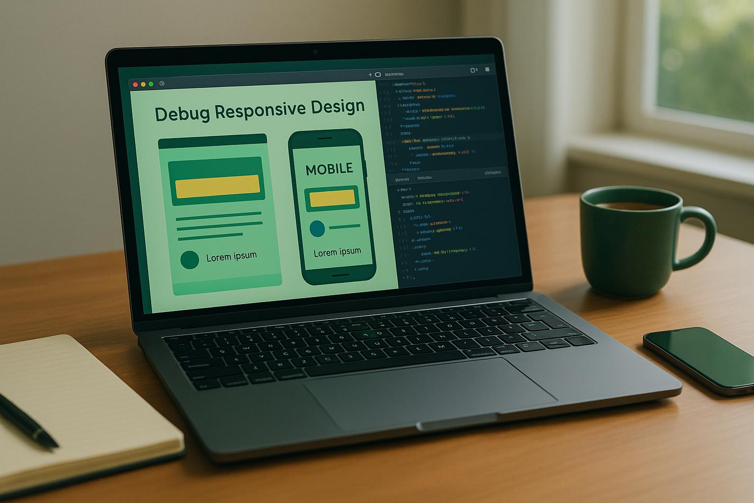
Responsive design ensures your website looks and works well on all devices. But when it breaks, it can frustrate users, hurt SEO, and cost you conversions. Here’s how to fix it:
Key Takeaways:
- Why It Matters: Over 60% of web traffic comes from mobile devices. Broken layouts increase bounce rates and damage user trust.
- Tools You Need: Start with free tools like Chrome DevTools for quick fixes. Use platforms like BrowserStack or LambdaTest for real-device testing.
- Common Issues: Watch for missing viewport tags, fixed-width elements, unreadable text, or buttons that are hard to tap.
- Step-by-Step Process:
- Inspect elements and tweak CSS live using browser tools.
- Test media queries and breakpoints for layout consistency.
- Simulate slow networks to catch performance issues.
- Validate on real devices for hardware-specific quirks.
Quick Comparison: Browser Tools vs. Cloud Platforms
| Feature | Browser-Based Tools (e.g., Chrome DevTools) | Cloud Platforms (e.g., BrowserStack) |
|---|---|---|
| Cost | Free | Starts at $25/month |
| Device Coverage | Limited to emulation | Real devices and browsers |
| Accuracy | May miss subtle issues | Highly precise |
| Ease of Use | Quick and simple | Requires setup |
Fixing responsive issues isn’t just about making things look good – it’s about ensuring your site works for everyone, everywhere.
How I find and debug issues in my CSS
How to Identify Common Responsive Design Issues
Catching responsive design problems early can save you a lot of headaches – and keep your users happy. With 73.1% of users leaving websites that aren’t mobile-friendly, it’s clear that addressing these issues is crucial for retaining your audience.
Using Browser Developer Tools
Tools like Chrome DevTools make it easier to spot potential responsive design flaws before they reach your users. With its Device Mode, you can simulate various screen sizes right in your browser, helping you identify layout inconsistencies across different devices.
To get started, right-click on an element and select "Inspect." This opens up live CSS editing, where you can tweak styles and immediately see the results. Switch to Device Mode to test your design on pre-set devices like the iPhone X, iPad, or Galaxy S5 – or create custom dimensions to match specific screen sizes.
You can also enable network throttling to mimic slower connection speeds. And don’t forget to use the rotate view option to check how your layout behaves in both portrait and landscape orientations.
Common Issues to Look For
Some of the most frequent responsive design problems include:
- Missing viewport meta tags
- Fixed-width elements causing content overflow
- Text that’s too small to read comfortably
- Buttons or touch targets that are hard to tap
- Slow-loading pages
- Gaps in media queries leading to inconsistent layouts
Testing on Emulators and Real Devices
Browser emulators are a great starting point for quick testing. They let you check layouts across different screen sizes and run basic functionality tests. However, because they operate on desktop hardware, they can’t give you accurate insights into CPU usage, battery life, or memory performance in real-world conditions.
Real devices, on the other hand, reveal issues tied to actual network connectivity, touch responsiveness, and hardware-specific quirks.
| Aspect | Emulators | Real Devices |
|---|---|---|
| Performance Testing | Limited and often inaccurate | Provides accurate real-world metrics |
| Network Testing | Simulated network conditions | Tests real Wi-Fi and mobile networks |
| Hardware Features | Can mimic some, but not all features | Essential for sensors, cameras, etc. |
| Cost | Low-cost or free | Can be expensive at scale |
| Debugging Speed | Easier and faster debugging | More challenging but shows real behavior |
The best strategy is to combine both methods. Use emulators for quick checks and initial debugging, then move to real devices for validating performance, connectivity, and hardware-specific behaviors.
"Testing on real devices is the only way to be certain it works." – bagera_se
When testing on real devices, prioritize the most popular devices among your users. Add a few less common ones with older operating systems or unique screen sizes to cover edge cases. This balanced approach helps you catch the majority of issues while keeping the testing process efficient and cost-effective. These early tests will guide the next steps in debugging and optimization.
Tools for Debugging Responsive Design
When it comes to debugging responsive design issues, having the right tools can make all the difference. After all, 73% of web designers believe non-responsive design is one of the main reasons visitors abandon websites. Whether you’re troubleshooting during development or conducting extensive testing, the tools you choose should align with your workflow. Browser-based tools are great for quick fixes, while cloud-based platforms let you test across a wide range of devices and browsers in real time.
Chrome DevTools Features
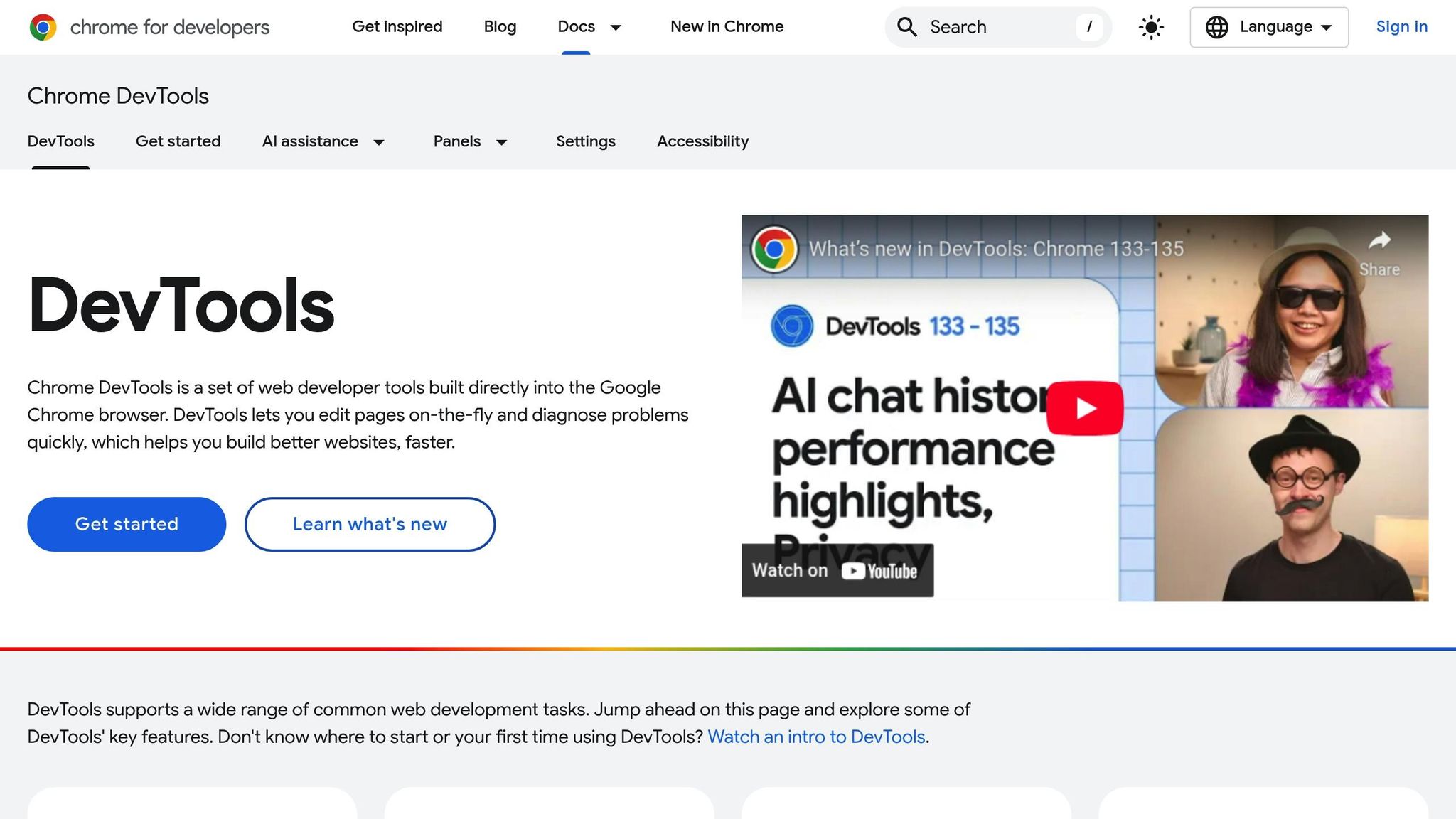
Chrome DevTools is a go-to option for many developers, thanks to its built-in mobile simulation capabilities. Device mode in Chrome DevTools allows you to emulate various devices directly within your browser. Using the Device Toolbar, you can test your design on smartphones, tablets, desktops, or even use the "Responsive" setting to dynamically adjust screen sizes and see how your layout behaves.
Beyond basic simulations, Chrome DevTools offers advanced debugging features to tackle more complex issues. For example, you can:
- Simulate touch gestures like pinch-to-zoom and swipe to ensure interactive elements work as expected.
- Use network throttling to mimic slower internet connections and see how your site performs under those conditions.
- Test specific media query breakpoints to verify your CSS rules.
- Visualize CSS Flexbox and Grid containers to pinpoint alignment problems.
- Capture full-page or viewport-specific screenshots for documentation or comparison purposes.
While Chrome DevTools is excellent for initial debugging, you’ll need additional tools for testing across multiple browsers and devices.
Cross-Browser Testing Platforms
To ensure your site works flawlessly for all users, cross-browser testing platforms are essential. With 52% of web traffic coming from mobile devices and 83% of users expecting a consistent experience across platforms, thorough testing is a must.
One standout option is BrowserStack Live, which provides real-time access to a wide array of devices and browsers. You can test across different versions of Edge, Safari, Firefox, Chrome, Opera, and Internet Explorer, as well as platforms like Windows, macOS, Android, and iOS. Another strong contender is LambdaTest, which offers AI-powered testing capabilities. Both platforms provide extensive features, though their pricing and specific tools vary.
Additional Tools for Advanced Debugging
For even more specialized needs, tools like Sauce Labs and TestGrid offer unique benefits. TestGrid, for instance, supports real devices and provides multi-browser compatibility through a cloud-based setup. This can be especially valuable for teams that need access to a wide range of devices without the hassle of maintaining physical hardware.
When deciding which tools to use, think about factors like device and browser support, ease of use, integration with your workflow, and scalability. A smart approach is to combine tools: use Chrome DevTools for quick debugging and fixes, then turn to cloud-based platforms for more comprehensive testing.
| Platform | Starting Price | Key Strength | G2 Rating |
|---|---|---|---|
| BrowserStack | $29/month | Real device testing | 4.5 (1,318 reviews) |
| LambdaTest | $25/month | AI-powered testing | 4.5 (1,136 reviews) |
| Sauce Labs | $49/month | Unlimited users/minutes | 4.5 (142 reviews) |
sbb-itb-edfb666
Step-by-Step Debugging Process
Once you’ve chosen your tools and identified common issues, it’s time to dive into a structured debugging process. Tackling responsive design problems methodically ensures you address issues efficiently and avoid potential headaches for your users. Start with the basics and gradually move into more detailed troubleshooting.
Inspect Elements and CSS
Begin by opening DevTools (right-click an element and select "Inspect" or use shortcuts) to access the Elements panel, which serves as your primary workspace. Here, you can view the page’s DOM structure and all the CSS rules applied to each element. This is where you’ll see which styles are active, their order of specificity, and how they interact.
"DevTools lets you edit pages on-the-fly and diagnose problems quickly, which helps you build better websites, faster." – Chrome DevTools
With live editing, you can tweak CSS properties, toggle declarations, and test changes instantly – no need to refresh the page. This is especially handy for responsive design, as you can experiment with different width values, spacing, or alignments on the spot.
Right-clicking elements in the DOM inspector offers additional tools, such as deleting nodes, editing HTML directly, toggling element states (:hover, :active, :focus), or copying CSS/HTML paths. These options are invaluable when troubleshooting elements that behave inconsistently across screen sizes.
For responsive debugging, use Inspect Element to quickly highlight problematic code and analyze its behavior across various screen sizes. After identifying issues, test your layout at key breakpoints to ensure everything adjusts as intended.
Testing Breakpoints and Media Queries
Responsive design revolves around breakpoints, so testing them thoroughly is critical. Focus on key breakpoints like 320px, 480px, 768px, 1024px, and 1200px. Tools like Chrome DevTools’ Device Mode let you simulate mobile devices by setting viewport dimensions, device pixel ratios, and orientations. Media query breakpoints are conveniently displayed above the viewport, making it easy to test how your layout responds.
Start with a mobile-first approach, designing for the smallest screen size first and scaling up. This method often exposes layout issues early on. Add breakpoints where your layout begins to "break" – for example, when text becomes unreadable or elements are awkwardly sized.
Use viewport rulers to measure element sizes in pixels, ensuring they’re appropriately scaled for touch interactions on mobile devices. Once your breakpoints are functioning well, test your layout under more realistic conditions to confirm your fixes.
Simulating Network Speeds and Validating Fixes
Simulating real-world network conditions is a crucial step in responsive debugging. Slow connections can reveal issues with loading times, image responsiveness, or UI glitches that might go unnoticed on faster networks.
Use Chrome DevTools’ network throttling feature – or tools like Xcode or Charles Proxy for iOS/Android – to test your design under conditions like 3G, slow 3G, or even offline. This ensures your layout remains functional and visually intact even when assets load slowly.
Testing on real devices is equally important since emulators can’t fully replicate the nuances of actual hardware. Real device cloud testing offers a more reliable way to validate touch interactions, scrolling, and overall usability. This step is crucial to ensure your design feels polished in the hands of users.
Pay close attention to how your layout behaves when images or assets fail to load. Responsive designs should remain functional and visually coherent even in these scenarios. Finally, include the viewport meta tag in your HTML to ensure consistent rendering across devices. This small step can prevent many common responsive design issues from the get-go.
Comparing Debugging Methods and Tools
When tackling responsive design issues, developers typically rely on two main methods: browser-based tools and cloud-based platforms. Each offers unique strengths, making them suitable for different stages of the debugging process.
Browser-based tools, like Chrome DevTools, are integrated directly into your browser. They’re perfect for quick checks during development, offering real-time editing capabilities without requiring extra setup. Being free and easily accessible, these tools are often the go-to option for developers working on responsive designs.
On the other hand, cloud-based platforms such as BrowserStack and LambdaTest provide access to real devices and browsers hosted on remote servers. These platforms excel in testing across a wide range of real-world environments, ensuring your design performs consistently. Let’s dive into a detailed comparison of these methods:
Browser-Based vs. Cloud-Based Debugging Tools
The choice between these tools depends on factors like your project’s requirements, budget, and the level of precision needed. Here’s how they stack up:
| Feature | Browser-Based Tools (Chrome DevTools) | Cloud-Based Platforms (BrowserStack, LambdaTest) |
|---|---|---|
| Device Coverage | Limited to emulated devices | Extensive range of real devices and browsers |
| Accuracy | Emulation may miss subtle details | Real device testing ensures precise rendering |
| Ease of Use | Great for quick checks | Offers more features but can be more complex |
| Collaboration | Limited (extensions may be needed) | Built-in tools like screenshots and bug logging |
| Cost | Free | Subscription-based |
| Scalability | Limited | Highly scalable |
One of the biggest differences lies in device coverage. Browser-based tools simulate devices, while cloud platforms provide access to actual hardware. For example, BrowserStack lets you test on a wide range of real Android and iOS devices. This is especially important for assessing touch interactions, hardware-specific behaviors, and performance under real-world conditions.
Accuracy is another critical factor. Emulated environments might miss subtle rendering issues that only show up on actual devices. Real device testing ensures your design performs consistently across varying screen resolutions, processors, and operating system versions.
When it comes to cost, browser-based tools have the advantage of being free, whereas cloud platforms require a subscription. These subscription costs can scale based on usage and team size, making them more suitable for larger projects or teams.
Security is another consideration. Many cloud platforms offer robust privacy features and regular updates to support new browsers and devices, adding an extra layer of reliability.
A balanced approach often works best: start with browser-based tools for initial development and quick fixes, then move to cloud-based platforms for thorough testing on real devices. This combination ensures your design is polished and performs seamlessly across all target environments.
Conclusion
Now that we’ve covered the tools and methods for tackling responsive design challenges, the next step is turning those insights into real-world improvements. Debugging responsive design issues requires a systematic and focused approach to achieve the best results.
Key Points Recap
Effective debugging starts with isolating the problem. This means systematically testing individual components – like CSS media queries, JavaScript frameworks, or layout structures such as Flexbox and Grid – across various environments to identify mismatches. Testing your site across multiple browsers and devices is equally important. With mobile traffic dominating the web, ensuring flawless responsiveness is no longer optional.
User experience should always take center stage. Debugging is not just about fixing errors – it’s about improving usability and performance. Research shows that responsive design accounts for 91.5% of the usability of academic websites and 74.7% of their overall effectiveness.
The benefits of proper debugging are evident. For example, an e-commerce website that adopted a systematic debugging approach discovered that large image files were causing slow load times. By addressing this issue, they reduced load times by 40%, which led to a significant boost in user retention.
Using a mix of browser-based tools for quick fixes and cloud-based platforms for real-device testing helps catch both glaring issues and subtle rendering problems. Additionally, documenting your debugging process and utilizing version control systems can save time and effort during future troubleshooting sessions.
These practices lay the groundwork for ongoing optimization and better performance.
How Kreativa Inc. Can Help

At Kreativa Inc., we take these strategies a step further, offering tailored solutions to ensure your website performs seamlessly across all devices. We know that debugging responsive design is just one part of the broader effort to enhance your website’s performance and user experience.
Our services include free usability and SEO audits to pinpoint responsive design issues before they affect your audience. These audits assess your site’s performance on various devices, uncover conversion rate optimization opportunities, and identify areas where responsive design improvements can elevate your search engine rankings.
Beyond identifying problems, we focus on turning fixes into results. Our conversion rate optimization services are designed to transform technical improvements into increased user engagement and conversions. Whether you need ongoing maintenance, a complete responsive design overhaul, or strategic digital marketing support, Kreativa Inc. has the expertise to enhance your online presence and deliver measurable success.
FAQs
How can I make sure my website looks great and works well on both mobile and desktop devices?
To make sure your website looks great and works well on both mobile and desktop devices, start with a fluid grid layout. This type of layout adjusts proportionally to fit any screen size, ensuring your design remains consistent. Add CSS media queries to refine styles for various devices and screen resolutions, tailoring the experience for each user.
Adopting a mobile-first approach is a smart move. Begin by designing for smaller screens, then scale up for larger ones. This way, your site will be optimized for the most commonly used devices. Use flexible images and scalable vector graphics (SVGs) to keep visuals sharp and adaptable, avoiding fixed dimensions that might break the layout.
Finally, test your site across different devices and browsers. This step helps you identify and fix any display problems early, ensuring a smooth experience for all visitors.
Should I use browser-based tools or cloud-based platforms to test responsive design issues?
When choosing between browser-based tools and cloud-based platforms for testing responsive design, the right option depends on your specific needs and workflow.
Browser-based tools are perfect for quick, real-time testing. They allow you to check how your design performs on specific devices and browsers, offering immediate feedback to address targeted issues. These tools are especially handy for smaller tasks or when you need rapid results.
On the flip side, cloud-based platforms are designed for larger projects and team collaboration. They provide scalable testing solutions and support continuous integration, making it easier to test across a broad range of devices and environments. This approach is ideal when you need comprehensive coverage and flexibility.
Ultimately, the choice comes down to your project’s size, budget, and how often you need to test. If speed and simplicity are key, browser-based tools might be your go-to. For more extensive and collaborative testing needs, cloud-based platforms are often the way to go.
Why should I test my website on real devices instead of just using emulators or simulators?
Testing your website on actual devices is crucial because it delivers a real-world user experience. While emulators and simulators can mimic how your site might function, they often fall short in identifying key issues like hardware-specific glitches, performance inconsistencies, or touch sensitivity problems.
By testing on real devices, you can ensure your website performs smoothly across various screen sizes, operating systems, and browsers. This approach helps you spot and address potential issues before they impact your users, leading to a more consistent and dependable experience that enhances user satisfaction and keeps them engaged.